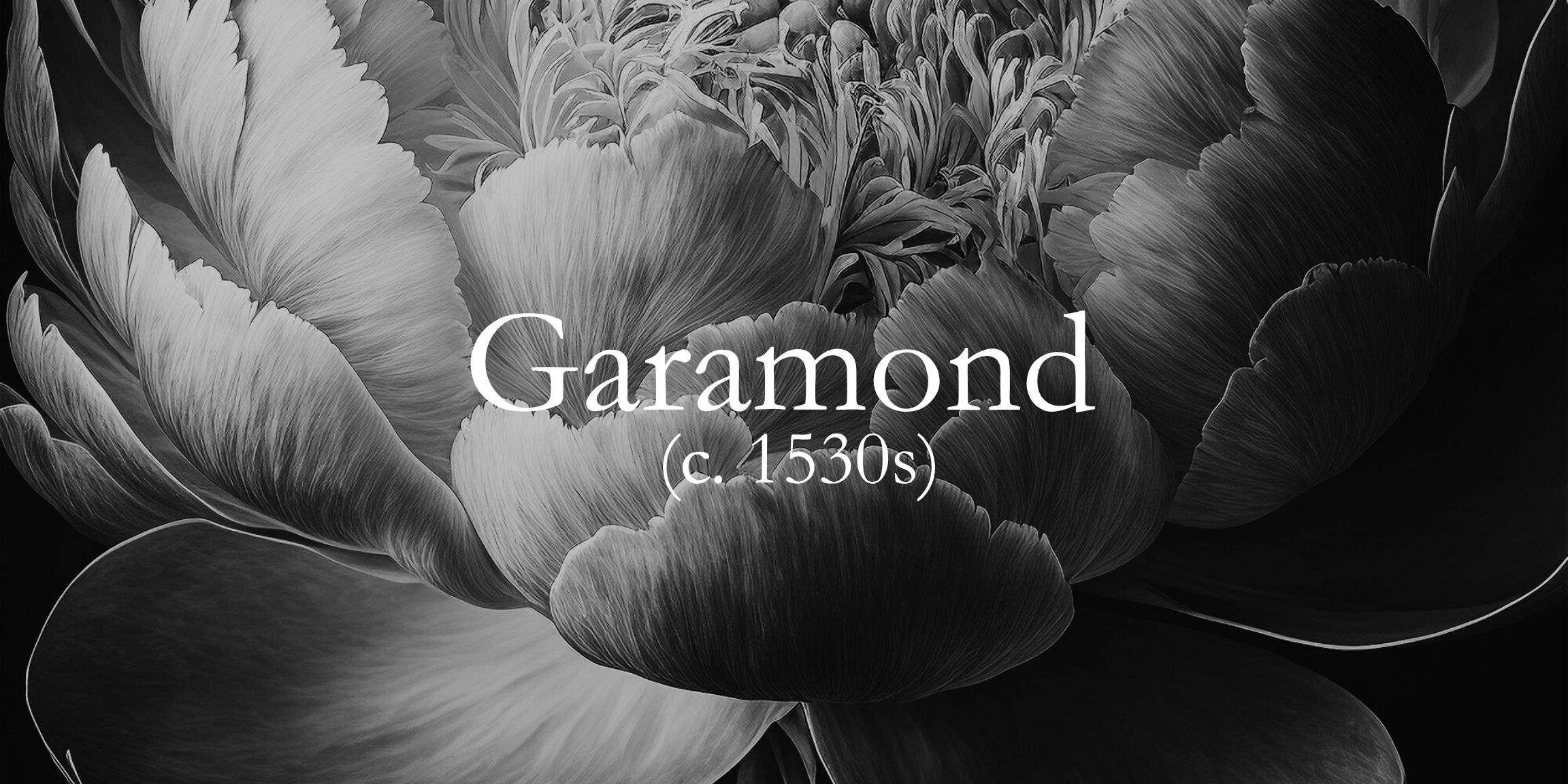
The Elegant Serif Font Rooted in Renaissance Design
Born: c. 1530s, France
Designed by: Claude Garamond
Font Style: Old-style serif
Known For: Elegant curves, readability, literary charm
The Origin – Claude Garamond and the Renaissance
Garamond is one of the oldest typefaces still in use – and it’s aged like fine wine. Designed by Claude Garamond, a punchcutter working during the French Renaissance, it was inspired by humanist handwriting and Roman letterforms. His graceful, balanced letterforms set a new gold standard in legibility and aesthetics for book printing.
How It Has Evolved Over the Centuries
Garamond’s work was widely admired and imitated. Centuries later, multiple versions exist – from Stempel to Adobe Garamond – each honouring the softness, wide counters, and low contrast that give this typeface its uniquely human feel.
Who Uses Garamond – Famous Brands and Publishers
You’ll find Garamond woven into the fabric of publishing and luxury design. National Geographic favoured it for editorial content in its earlier editions. Apple used it in its early marketing materials to bring clarity and warmth to tech. Google included it in branding guides, while Abercrombie & Fitch and Rolex adopted it for refined print campaigns that convey timeless sophistication.
Why Designers Love It – Readability with Charm
Garamond invites slowness. It’s made for text you want to savour – literature, essays, history. It’s a favourite in publishing and luxury branding alike. If this font were a person, they’d be thoughtful, well-read, and quietly confident. Garamond is timeless not because it clings to the past – but because it still feels alive on the page.

")
