The Refined Classic that Balances Rationality and Romance
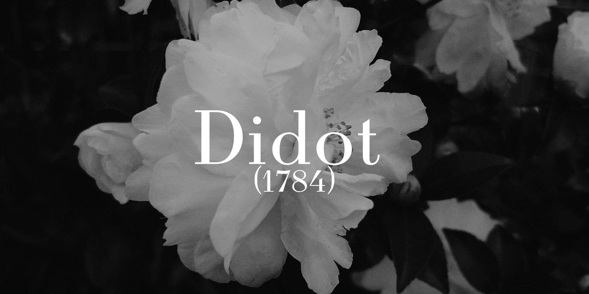
Born: 1784, France Designed by: Firmin Didot Font Style: Modern serif (Didone) Known For: Hairline serifs, vertical elegance, French poise
The Origin - Firmin Didot and the French Enlightenment
Didot emerged in the age of reason – when enlightenment ideals met artistic finesse. Firmin Didot, printer and designer, refined type to its most elegant extremes: high contrast, fine hairlines, and perfect verticality. It wasn’t just type – it was a work of precision, created for an era obsessed with order and beauty.
How It Has Evolved and Endured
Didot has seen many digital reimaginings (Linotype, HTF, and more), but always keeps its elegance intact. Like its Italian cousin Bodoni, it thrives at large sizes, where its razor-sharp lines and refined proportions can truly shine.
Who Uses Didot – Fashion Houses and Artistic Institutions
Didot is the darling of fashion. Harper’s Bazaar, Giorgio Armani, and Zara have all used it to evoke timeless chic. It’s a favourite among brands that want to blend intellect with allure – think editorial layouts, gallery invites, and high-end packaging.
Why Designers Love It – Sophistication with Precision
Didot doesn’t shout, it glides. It’s a designer’s go-to when they want to speak with elegance and structure. If Didot were a person, they’d be a Parisian archivist with perfect taste, dry wit, and a killer library.