
Helvetica
The World’s Most Iconic Sans-Serif Typeface
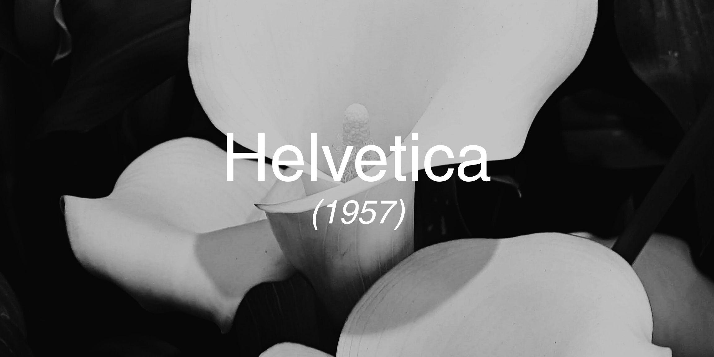
Born: 1957, Switzerland
Designed by: Max Miedinger (with Eduard Hoffmann)
Original Name: Neue Haas Grotesk
Font Style: Sans-serif
Known For: Clean lines, neutrality, modernist clarity

")
Helvetica Font Origins – Designed in Switzerland, 1957
Helvetica was born out of a post-war design renaissance. Switzerland in the 1950s was a haven for clarity, order, and balance – and designers were craving a typeface to match. Commissioned by the Haas Type Foundry, and designed by Max Miedinger (with Eduard Hoffmann) , Helvetica was originally called Neue Haas Grotesk. It was meant to compete with the popular Akzidenz-Grotesk but with improved legibility and more refined geometry.
Why It’s Called Helvetica – The Name Behind the Typeface
In 1960, as the typeface gained international traction, it was renamed Helvetica – a nod to the Latin word for Switzerland, Helvetia. The new name made it more globally palatable, and soon Helvetica was everywhere. It became the visual voice of modernism. Designers adopted it not just for its form, but for its philosophy – neutrality, universality, and the idea that type should serve content, not overshadow it.
Famous Brands That Use Helvetica Font
You’ll spot Helvetica across industries and continents – from American Apparel’s pared-back brand identity to Lufthansa’s wayfinding systems. Microsoft used it for UI elements in early Windows, while BMW and Nestlé leaned on it for sleek, modern branding. It also underpins the iconic NYC Subway signage – proof of its readability even in chaotic environments.
Helvetica’s Legacy in Modern Graphic Design
Helvetica became a cultural icon. It dominated corporate branding in the 1970s and ‘80s, influencing everything from advertising to transport systems. Its tight spacing, tall x-height, and no-nonsense strokes made it a designer’s dream: flexible, modern, and endlessly legible.